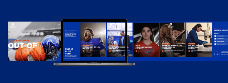
So you're about to embark on your next .edu redesign. One of the crucial first steps is to know your audiences and to know them well (hint: it's not your administration, faculty, or board.) This will help guide not only the planning and design process, but also give your team clear direction with content generation.
Truth be told, all great design works from the user backward. It affects how the design should look, the length of copy, the hierarchy of content, the placement of navigation, size of fonts, colors used, imagery, video, multimedia, so on and so forth. Knowing who is going to be visiting your site before they get there will allow the design to seamlessly talk to the visitor, increasing time on the site, interactions, and—ultimately, conversions.
Define your objectives.
Another vital part of the design process is to define your end goal from the very beginning.
- Are you trying to recruit new students?
- Encouraging alumni to give?
- How are you speaking to the parents of prospective students?
- Are you educating current students on student affairs/topics? (Hint: you should be.)
- Aiming for more student-athlete engagement?
You'll likely need to do all of the above and don't stop there. Keep defining. This may change along the way in the design process, and that's okay! (Honestly, it's usually a good sign.) Your design should be flexible enough that you can add a "give" button in the header when advancement is emailing about increasing alumni donations without breaking the aesthetics of the site.
Consider how a college needs to adapt to change throughout the span of a year. Narrowing in and targeting specific objectives will make the site much stronger. It will give your design that much more impact.
So, what is your brand anyway?
There's a reason that strategy precedes design and that research precedes strategy, but that's not to say they only exist in a uni-directional, linear relationship. In fact, one of the most influential checks and balances systems is simply designing around brand pillars. Your brand pillars articulate your organization's ethos: the why, the what, the how—and that is what creates compelling design. That is what creates brands that inspire and endure.
Design 101s
Think universally—most of the time. Maybe you have some wild ideas that can shine through in an undergrad admissions-oriented segment of your site that can skew fun and engaging while other areas that need to be more concise and to the point. Our strategy is to focus on the universal first and then customize to target audiences once you've designed a cohesive UX. To run through some higher ed design 101 thoughts and feelings, I need to state a few of the obvious design do's and don'ts.
- DO be mindful of diversity & inclusion. You're trying to create a sense of place for the user, which means if they see a picture or read a story and don't feel like they belong, how could they envision themselves attending your institution? Your approach should be inviting and welcoming of all people, but still authentic to your brand. If that's too much of a challenge, there may be more significant underlying problems.
- DO be engaging with your content.
- DO be bold with typography and let words speak for themselves.
- DON'T be afraid of white space. Or large blocks of color.
- DO experiment with positive and negative space and see how engaging it can be. Sometimes you just can't find the right photo for a topic. Try establishing an interesting way to use typography and color blocks to break up content instead.
Design for the times.
In today's landscape, we need to design for the devices people use most frequently. Going back to your audience, this is going to help define not only how you will place something on the page, but how you design the entire experience.
We often hear, "our site needs to look great on mobile, too," which we can't argue with, but maybe there's a better question to be asked. What's your audience using more: their phone or laptop? This should dictate your approach. In fact, maybe you should consider designing for mobile-first. Maybe you should try saying to yourself, "our site needs to look great on desktop, too."
That's not the whole story, though. Should the transition from mobile to desktop be seamless? Maybe it should be completely different?
So the next time you're deciding between placing a paragraph of copy or a quick, compelling call-to-action, try asking yourself:
- Who are we talking to? (Prospective Students? Alumni?)
- What device are they using? (iPhone? Laptop? Tablet?)
- What's our objective? (Conversion? Click-thru? Impressions?)
- What best aligns with our brand? (Is this true to our brand pillars?)
That's it. You just designed from the user-backward. No, you can't put UX/UI designer on your resume just yet, but you're definitely one step closer.


