A competitive usability evaluation is a user experience (UX) research method we use to quantify how a site functions relative to its competitors. There are different ways to conduct this type of study: the competitive review can be holistic, scoring targeted, high-value pages by overall site-usability metrics, or it can be more focused, comparing features or global elements across sites.
While we believe this is a crucial step in any web project, it's often glossed over in a subjective review to see how a site is different or more attractive than its competitors. Our approach is different: by using quantifiable data rather than anecdotal judgments, our clients are able to understand which elements work best for users and how to differentiate themselves from their competitive peer set.Competitive Evaluations Help Shape Site Redesign Goals
Competitive evaluations are typically conducted in the initial audit phase for any web redesign project because they help determine the direction of the site's new UX. The goals of the competitive evaluation should be clear before any work is started. A few things to ask yourself before conducting this type of activity are:
- What marketing and communication challenges are you trying to solve?
- What features on your site do you want to compare to others?
- How do high-value content sections compare on your site to others?
Keep in mind that competitors' sites solve almost the same design problems as you have; therefore, they make for important UX/UI benchmarks to achieve in the new design.
How SimpsonScarborough Conducts Competitive Evaluations
Our competitive evaluation takes the form of an expert review, where an experienced usability practitioner reviews the UX/UI based on their expertise and knowledge of usability. The output is a data-driven report that benchmarks a client's UX/UI compared to its competitors. Our team has developed a proprietary UX calculator to score pages and features.
SimpsonScarborough's UX Scoring Model
We score a page or feature based on standard best-practice criteria. The score for each criterion is the sum of four sub-criteria calculated on a 0-4 point system. The point system is defined as follows:
- 0 – Unusable
- 1 – Major Issue
- 2 – Minor Issue
- 3 – Cosmetic Issue
- 4 – Meets Criteria
Similar to grading an academic essay, our scoring operates through qualitative judgments of predetermined criteria. The total score for each criterion is represented as a 0-100% rating; a 95% can be interpreted as an "A," an 85% can be interpreted as a "B," etc.
What We Score
The criteria and sub-criteria of our UX calculator are informed by Nielsen Norman Group's usability heuristics and principles of visual design. These usability heuristics can be thought of as the standard criteria for digital design. In contrast, the visual design principles inform us of how design elements harmonize to create well-rounded and thoughtful visuals that drive intentional user behavior.
Simpsonscarborough analyzes criteria imperative to exemplary user experiences and interfaces, benchmarking how your site functions and how your site's design elements perform in relation to your competitor's site.
-
Usability Heuristics
- Match between system and the real world
- User control and freedom
- Consistency and standards
- Recognition rather than recall
- Aesthetic and minimalist design
-
Principles of Visual Design
- Scale
- Visual Hierarchy
- Balance
- Contrast
- Gestalt Principles
How We Determine What to Score
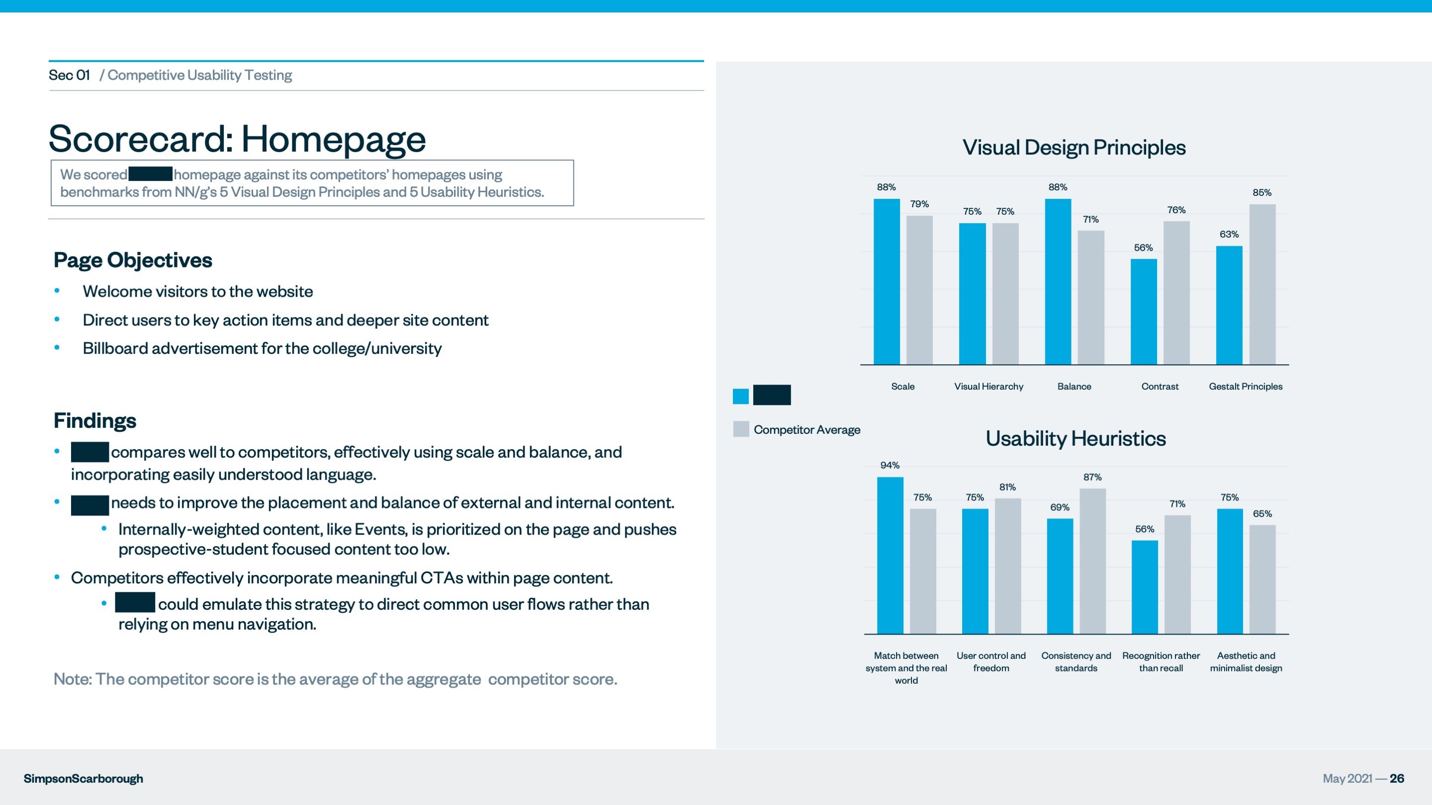
Pages or features are selected based on a myriad of inputs ranging from content evaluation observed in Google Analytics to recurring themes brought up by stakeholders in discovery sessions. Each page or feature receives an individual scorecard that provides insight into its visual design and usability compared to its average competitor's page or feature.
Example Scorecard

Sensitive information has been redacted to protect our clients.
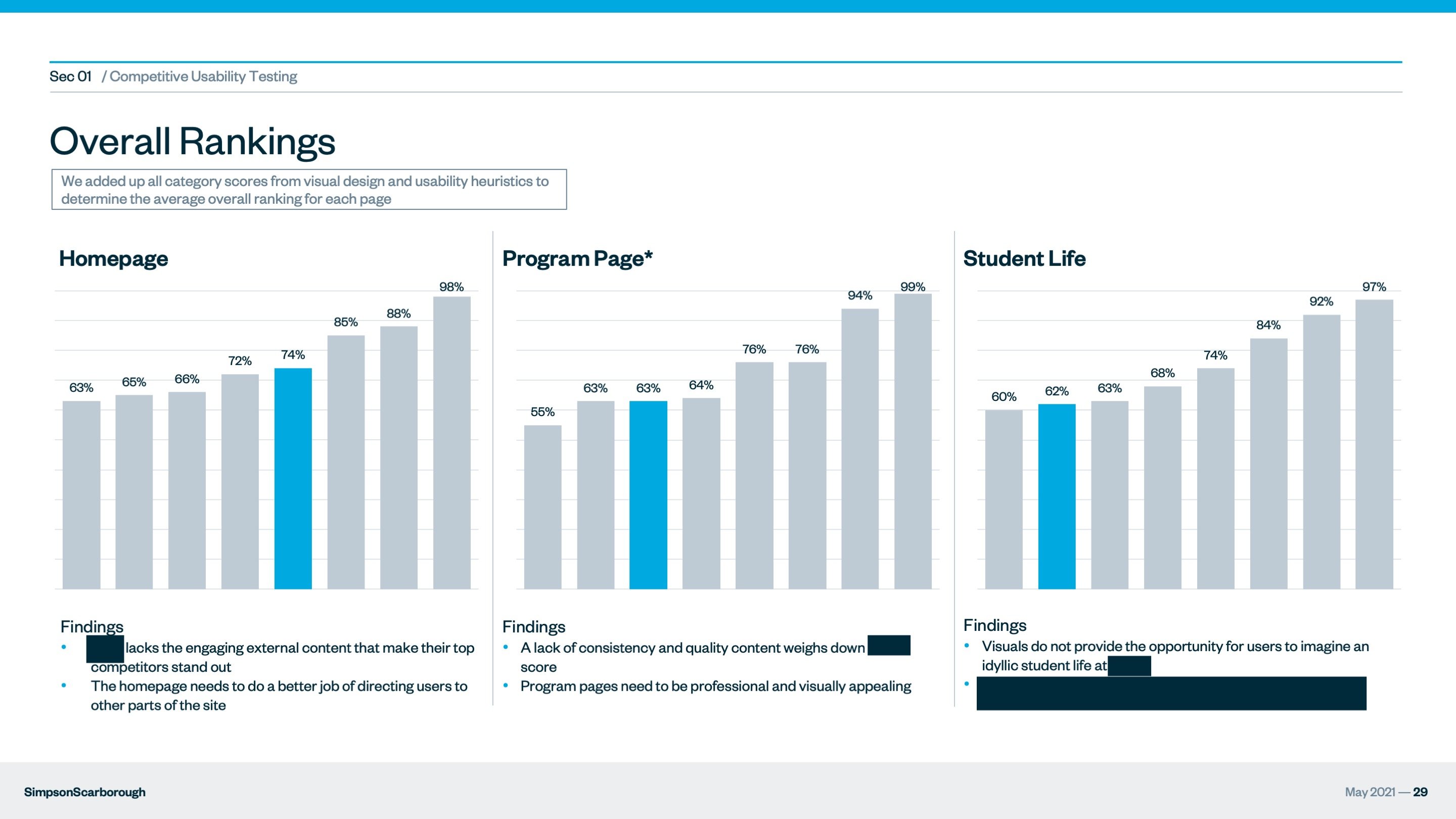
Example Overall Rankings

Sensitive information has been redacted to protect our clients.
We add up the scores of all criteria to determine the overall average ranking for each page or feature and provide insights into moving the design and usability forward. Implementing UX/UI best practices can quickly improve the overall score to be on par with top competitors' sites.
A Final Word on Competitive Evaluations
You want to surpass the competition — not copy them. Before redesigning your site, make sure that you identify the strengths and weaknesses of your own UX/UI by studying your competitors. The primary goal of a competitive evaluation is to gain deeper insight into why design elements work or fail so we can make data-driven decisions moving forward.
A competitive usability evaluation gives your team the advantage of reviewing several sites designs to better understand what your competitive peer set is doing — and what they're doing well. Calculating your design's usability in relation to your peer set will help your team create the best version of your new website.
—
Lex Hade is our Director of User Experience and part of our rapidly growing digital team. She's a graduate of Savannah College of Art and Design where she earned her B.F.A. in Painting. She credits the practice of watching people interact with paintings and seeing what they like and dislike to enhancing her ability to observe users navigate websites and web applications. Above all else, she's an absolute joy to work with. Learn more about Lex and the rest of our team here.


