When designing a new building there are laws the architect and contractor must follow to make sure the building is accessible to all people. These accessibility standards can be as straightforward as ensuring the space has elevators and ramps as staircase alternatives; that the width of door frames are wide enough to accommodate wheelchairs; or ensuring handicap stalls in parking lots meet the required dimensions. Other accessibility standards may be slightly more complex or nuanced like installing visual fire alarms for the deaf or hearing impaired, or braille on all signage to accommodate the blind or visually impaired. These standards exist simply to ensure that the building is accessible to anyone and everyone.
But in an increasingly digital world, the realization came that we need to extend the same ethos of accessibility for all to our websites and digital presences. Enter the Web Content Accessibility Guidelines (WCAG): a set of rules and guidelines created by the World Wide Web Consortium (W3C). These are the standards that everyone should follow to ensure their website content is accessible for all.
What does it mean for higher ed marketers?
This is actually an increasingly major issue in the world of higher ed: There are currently hundreds of lawsuits against colleges and universities alleging a lack of site accessibility. In fact, if your institution accepts federal aid, it's federal law to have your site accessible for all. But this is about much more than avoiding litigation.
Truly great design starts from the user and works backward, which is why we build all of our digital experiences with accessibility as a fundamental priority. You would never build a new dorm without considering handicap accessibility, why should your institutional website be any different? Whether you're new to the conversation or just don't know where to start, we've compiled a few of our favorite tools and resources below that we use throughout both the development and design phase so you can start improving your site accessibility.
1. Use Siteimprove to identify accessibility issues
SiteImprove is our favorite subscription product. Many of our clients utilize SiteImprove not only to identify accessibility issues, but also to improve website performance and SEO, untangle analytics, provide content assessment, and quality assurance.
One of the features SiteImprove offers is the ability to segment errors based on the team member's background and skill level. By default, these categories are broken down into three categories: editor, webmaster, and developer. For example, some accessibility issues will require template level code changes that will typically need to be made by a web developer. Other changes, like adding image alt text or missing headings, are fixes easily remedied by a web content manager or webmaster.
2. Audit your high ed site for accessibility
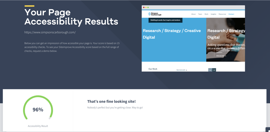
Check out their free audit tool and see where you stand. (We scored 96% because we had a duplicate element ID on our page. It's a great reminder why tools like this are so essential: it's easy to make a minor error even when you're designing for accessibility.)

A screenshot of our accessibility audit from Siteimprove. We scored a 96% and wanted to be transparent that while we might be good at what we do, we aren't perfect. That's why we rely on tools to make us better and catch the things we miss.
3. Use WebAIM's chrome extension
WebAim (Web Accessibility In Mind) is operated by the Center for Persons with Disabilities at Utah State University. Their mission is to expand the potential of the web for people with disabilities by providing the knowledge, technical skills, tools, organizational leadership strategies, and vision that empower organizations to make their own content accessible to people with disabilities.
One tool we use all the time is WebAIM's Wave Google Chrome extension (there's one for Firefox as well). Wave analyzes pages in real-time and identifies web accessibility errors. While not as in-depth as SiteImprove, the extension does a good job providing an overview of potential accessibility errors. We often use this tool at the beginning of a web audit. Wave is also used by the U.S. Department of Education as the first line of assessment when websites are reported for compliance.
4. Make sure your graphic design doesn't discriminate
Another tool we use from WebAim is the Contrast Checker. Our designers use the resource to determine if the color contrast in their designs are accessible. The WGAC has published a detailed explanation of the contrast if you're interested in further reading. Still, it's important to remember that contrast minimums only scratch the surface of designing for accessibility. At a minimum, we recommend using this tool whenever you are adding new elements to your website that involved color blocks and text elements.
Make sure to take a look at these tools before you embark on your next redesign or re-skin. It'll be well worth the time and effort to make your site accessible to all users.
 Ben McCombs is SimpsonScarborough's Senior Web Strategist and likely the nicest front-end developer you'll ever meet. Read more about Ben and the rest of our team here.


